Luxurno
I was asked to create a user experience that is intuitive, efficient and enjoyable for stock analysis platform supported by machine learning algorithms. As a product designer, my role was to research user needs, conceptualise design solutions, and collaborate with the development team to ensure highest quality user experience.
01
Process
Research Phase
During the research phase, I conducted user interviews and analyzed competitor platforms. I discovered that one common paint point of users navigating were:
Overwhelming amount of information
Users struggled to interpret complex data
Defining Objectives
During Discovery workshops with a client, we established the target group as well as discussed ways to monetize the platform. Combining it with my previous research, after fully understanding the client's business goals and users needs, I suggested a paid subscription model. From a product design perspective, such an approach might be challenging for one main reason: there's no free trial therefore the client's landing page has to present their value as much as possible.
When it comes to user interface and user experience, financial and trading platforms operate on a very specific level. Based on the research findings, I defined the following objectives:
Reduce cognitive load by introducing simple user interface
Design data visualization that enhances user's information comprehension and decision-making
Enhance usability by optimizing navigation and reducing friction points
Wireframing and Prototyping:
Already at this point, using gathered insights, a I created wireframes to propose a layout and information architecture. The wireframes focused on simplifying the interface, prioritizing key information, and establishing a clear hierarchy of elements. I also created interactive prototypes to stimulate user interactions, test and validate proposed ideas and hypothesis.
Iterative Design:
Through iterative design cycles, I collaborated with the development team and stakeholders to refine the user interface. We incorporated user feedback, ensuring the platform aligns with users' expectations and requirements. During the process, key design considerations included:
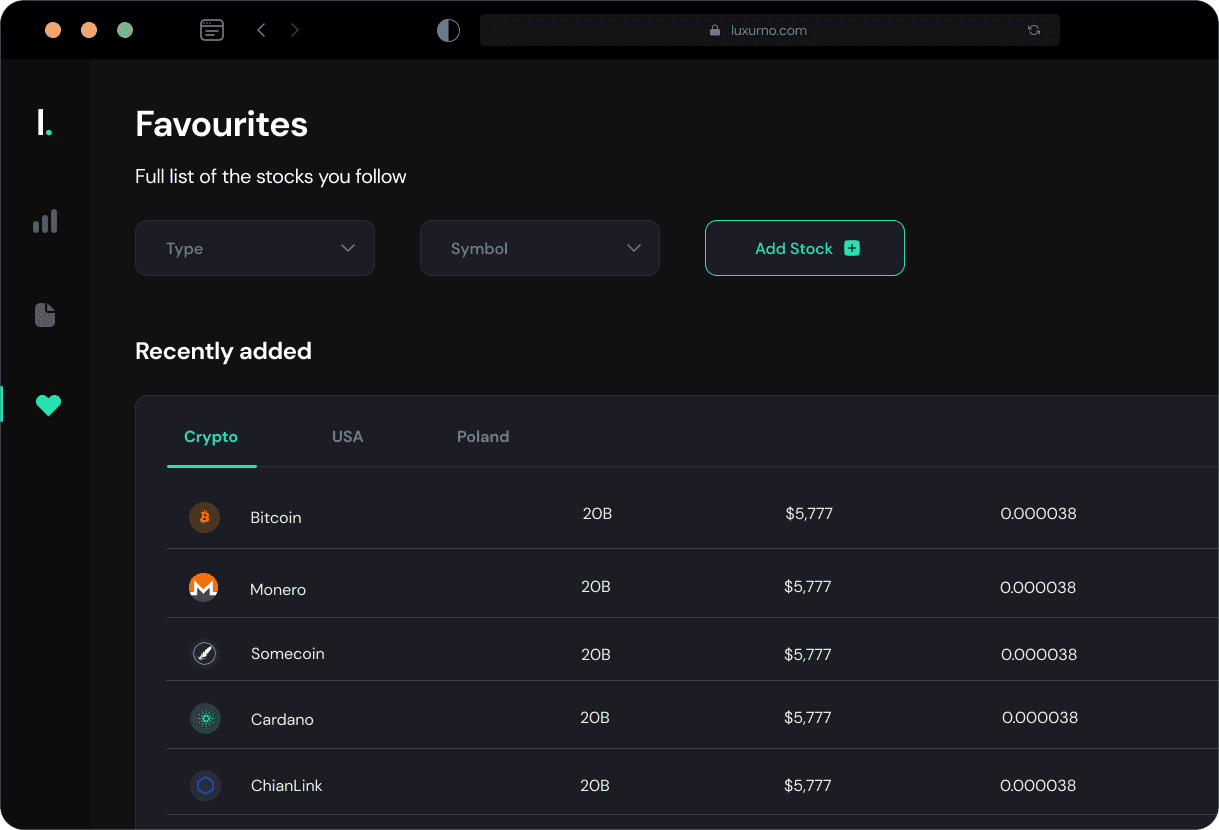
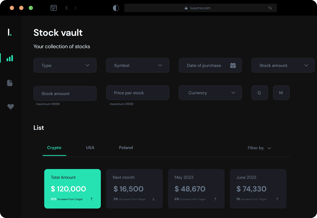
Clear and intuitive navigation. I simplified the navigation by reorganising the left panel menu and consolidated related features. The reduced number of clicks required to access key functionalities
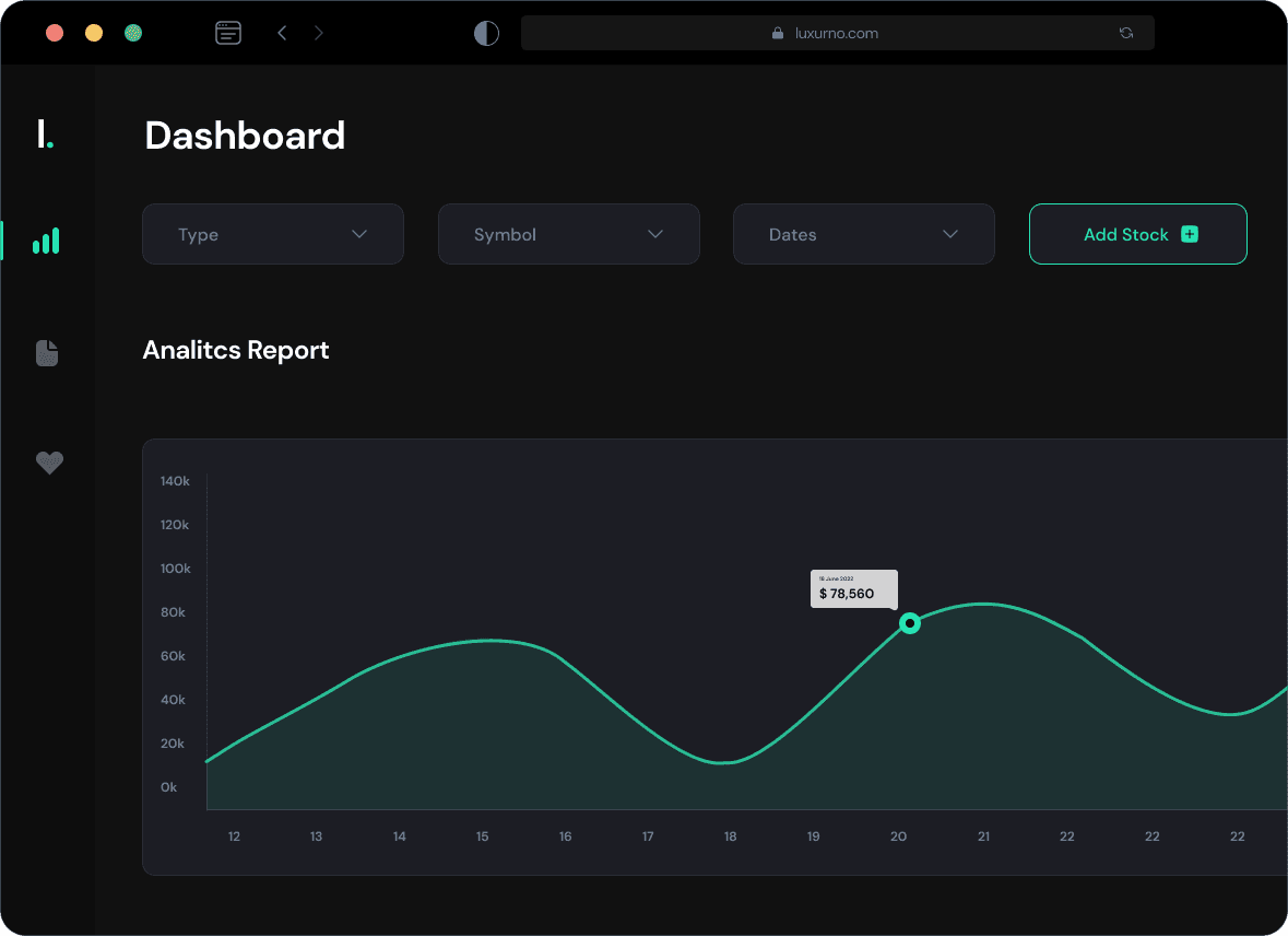
Visualizing data effectively: I revamped the charting tools, introduced interactive graphs and intuitive indicators to help users analyze stock performance more easily. I also added customizable timeframes for better historical data analysis.
02
Solution
Visual Design
The platform is aimed at daily basic stock operations and quite a diverse target audience. User interface has to be easy and accessible for users with different levels of tech-literacy. The visual design phase focused on enhancing the aestetics and visual coherence of the platform. I developed a modern and clean design that emphasized data clarity and readability. My huge point of reference was Revolut as I believe they provide a very seamless user experience among all financial platforms I'm familiar with. I would also analize similar trading platforms and discover their users' struggles to see what are the areas I could make things better and easier to use.
I started with creating a solid design system that would ensure consistency across all designs presenting different data types: tables, charts, many graphs to visualise, compare, sort and manage data.
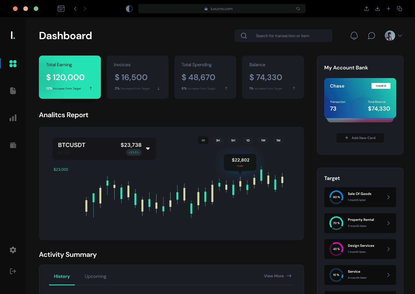
Dashboard
Luxurno platform is all about presenting data and numbers. Design included the comprehensive and diverse functionality which had to be presented to users in a simple and clear way - cognitive overload 🧠 seemed to be the key issue for users while navigating financial any platform. By research and testing of user Dashboard, after few iterations I came with final design that appeared to be easy to navigate among both experienced and non-experienced traders.
The layout is structured around intuitive navigation, high readability, light background, and simple, easy to distinguish data visuals. Minimalistic left side menu panel encourages easy navigation.
Landing Page
As for client's landing page, with collaboration with Marketing Team, I made sure landing page clearly communicates what is the business about, what value it provides and what are the options user can take depending on their level of interests in stocks.
04
Result
After implementing the new brand identity focused on making financial transactions and data consumption easy, fast, and secure, the results were impressive. The app experienced a notable increase in user engagement, with a significant uptick in active users. The streamlined and user-friendly interface resonated well with the target audience.